For investment managers with portfolios of hundreds of millions of dollars of publicly traded stock, it can be a challenge to buy and sell at scale on the New York Stock Exchange (NYSE) or the NASDAQ, where algorithms and hedge funds can see your order and buy up or sell off before you can complete the trade and make for a worse overall price by the time you are done. To solve this problem, our client was building an Alternative Trading System (ATS) for people with big orders to trade with each other.
The team’s approach before we got involved was a full-screen application that showed the current outstanding orders. It provided a lot of visibility into the order book, but took up a lot of valuable real estate on the trader’s desktop, especially since a lot of this information was already showing in other windows they would have open.
It was also hard to know when something that really needed your attention was happening. The engineering team had started to use toasts, the little alert popups that show in the lower right of the screen, but those could easily get unmanageable if a bunch of alerts happened at the same time.
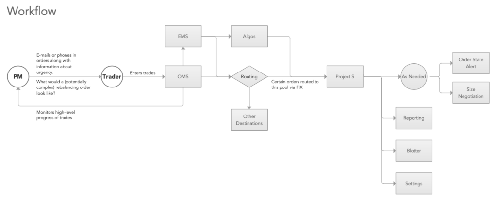
Our first step was to map out how traders would manage and execute large block trades..
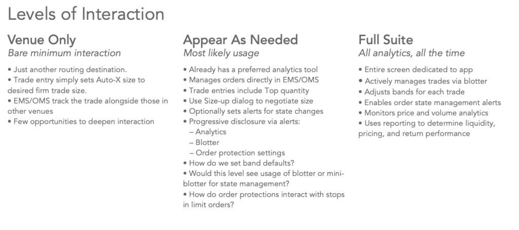
Next, we thought through how the application would support this workflow in various stances. “Venue Only” would make the exchange work completely on autopilot, with no UI. “Full Suite” was the full screen app in the original approach. “Appear As Needed” would reduce the window down to the bare essentials and show when there were orders that required the trader’s attention. It could still bring up the full screen window on demand.
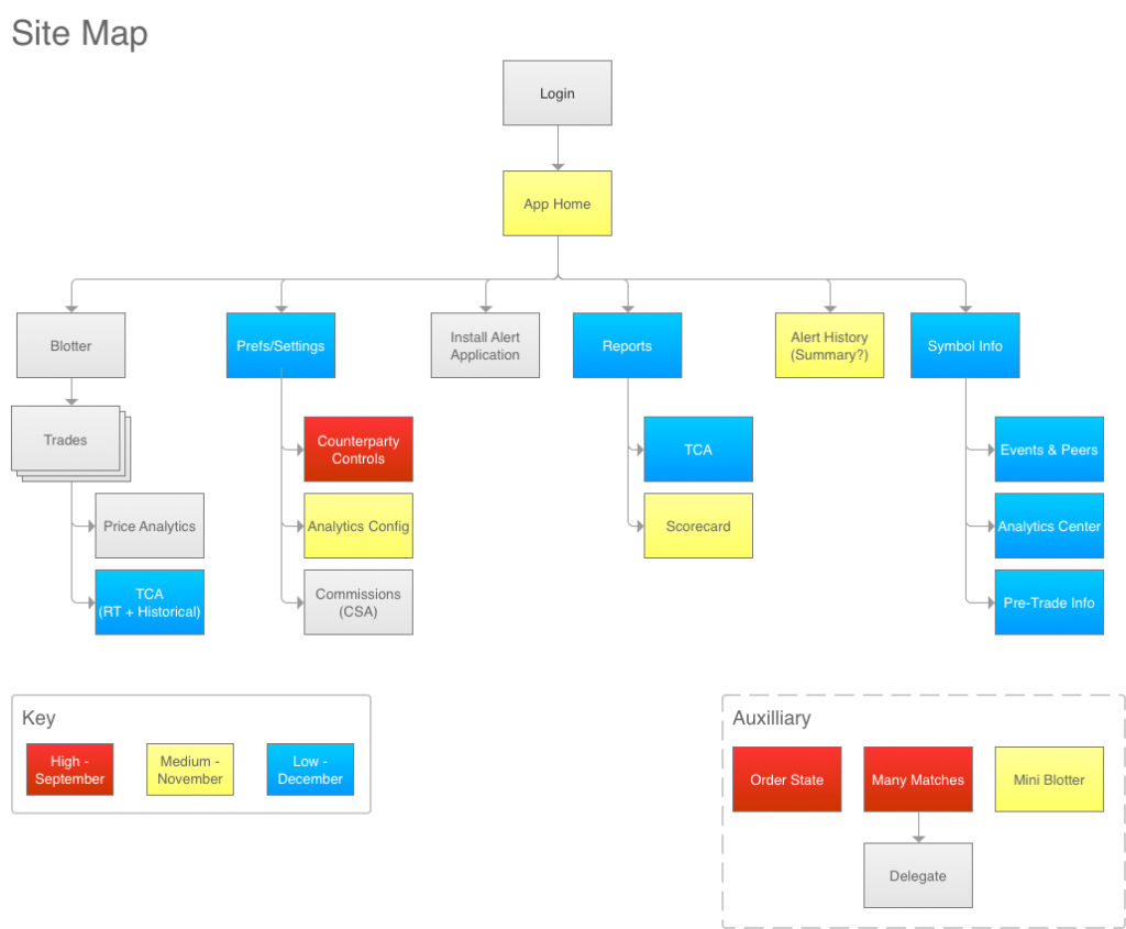
To understand the full context of the system, we mapped out all the screens that could support a trader in managing the execution of block trades. We used a color code to indicate the priority of each screen in the project plan.
The Mini-Blotter
Our first approach for the Mini-Blotter was to explore how to bring alerts into the same window where people would keep an eye on orders. It was a start, but an overwhelming mess. Our visual designer even found it “panic-inducing.”
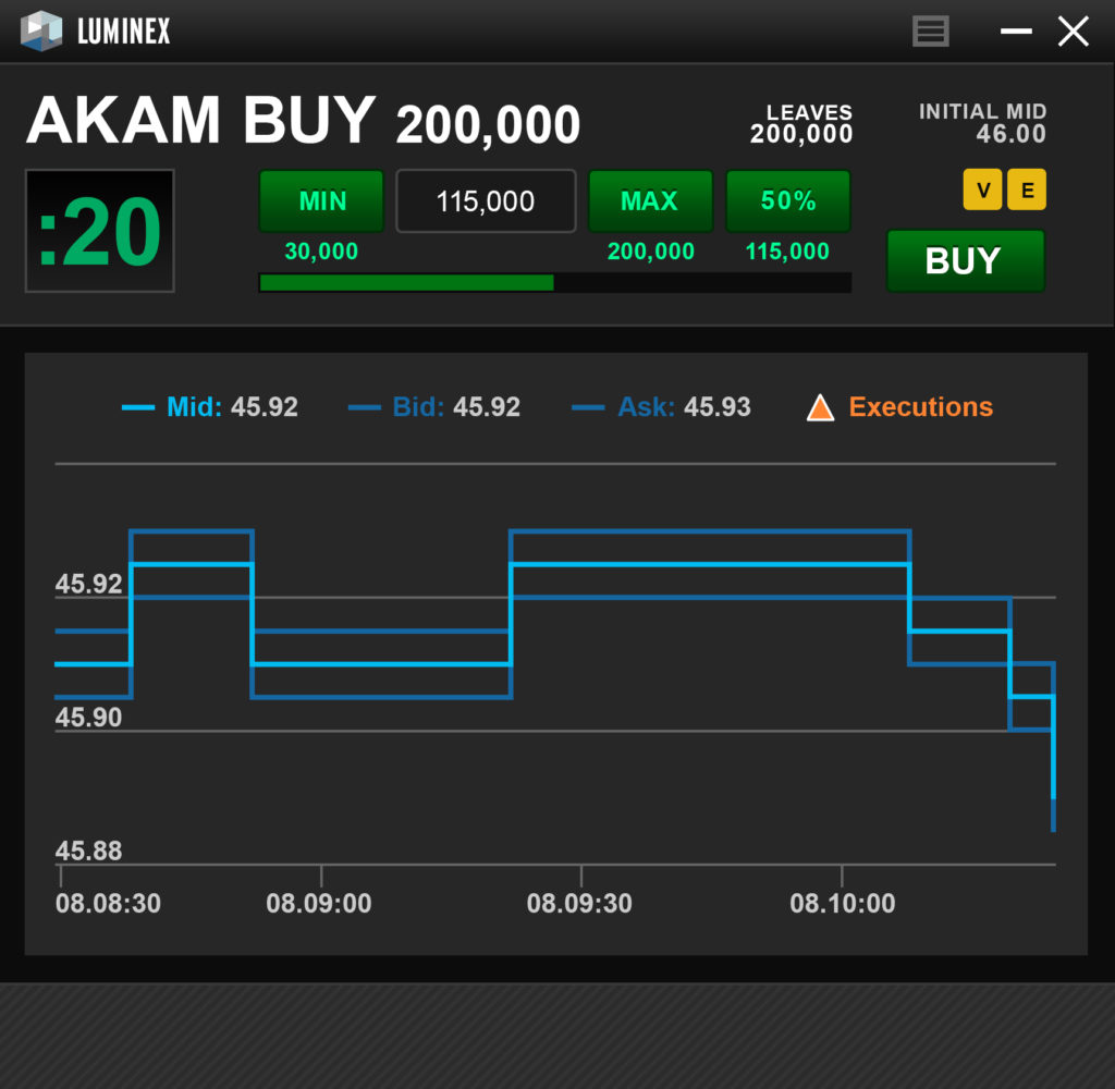
Next, we stripped the rows down to the essential information a trader would reasonably be able to process in the 0:20 second time limit for each trade alert.
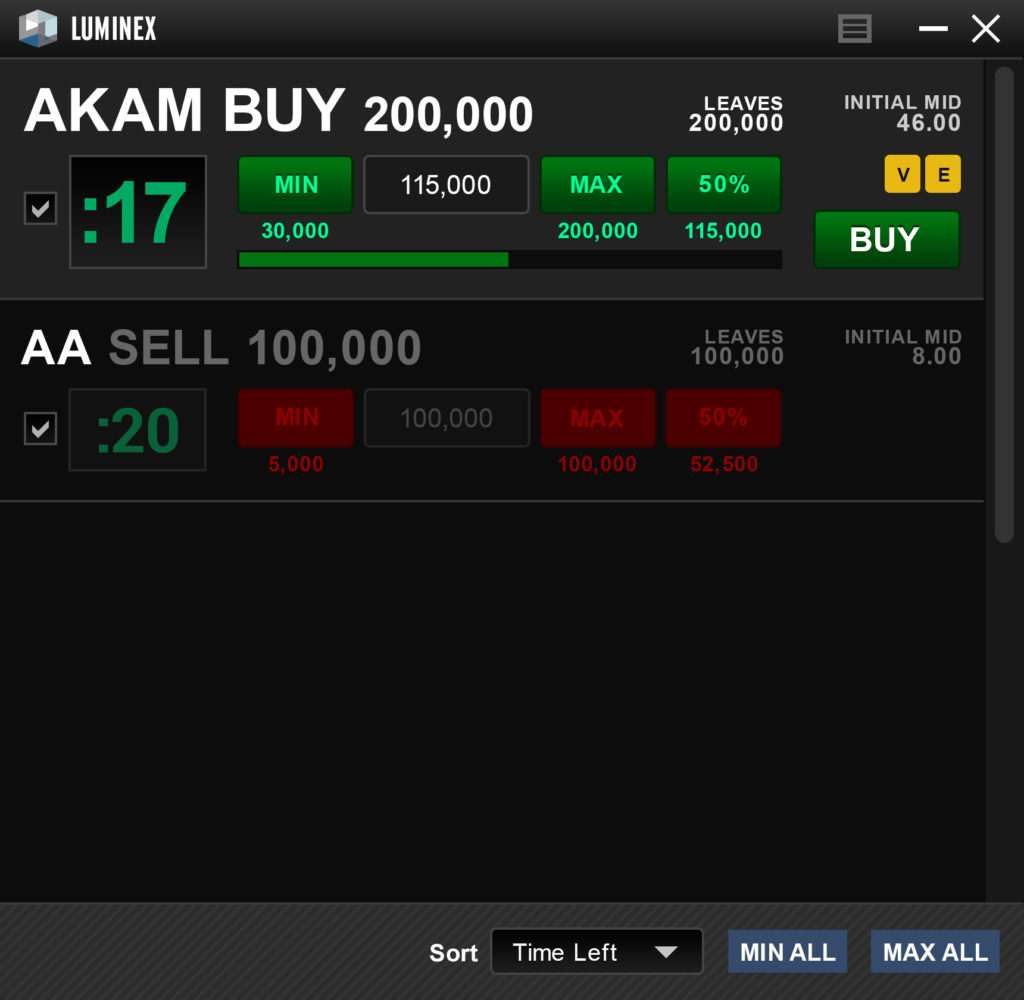
Then we focused on how notifications for trade alerts would appear in the window. Here are two of the alternatives we tried:
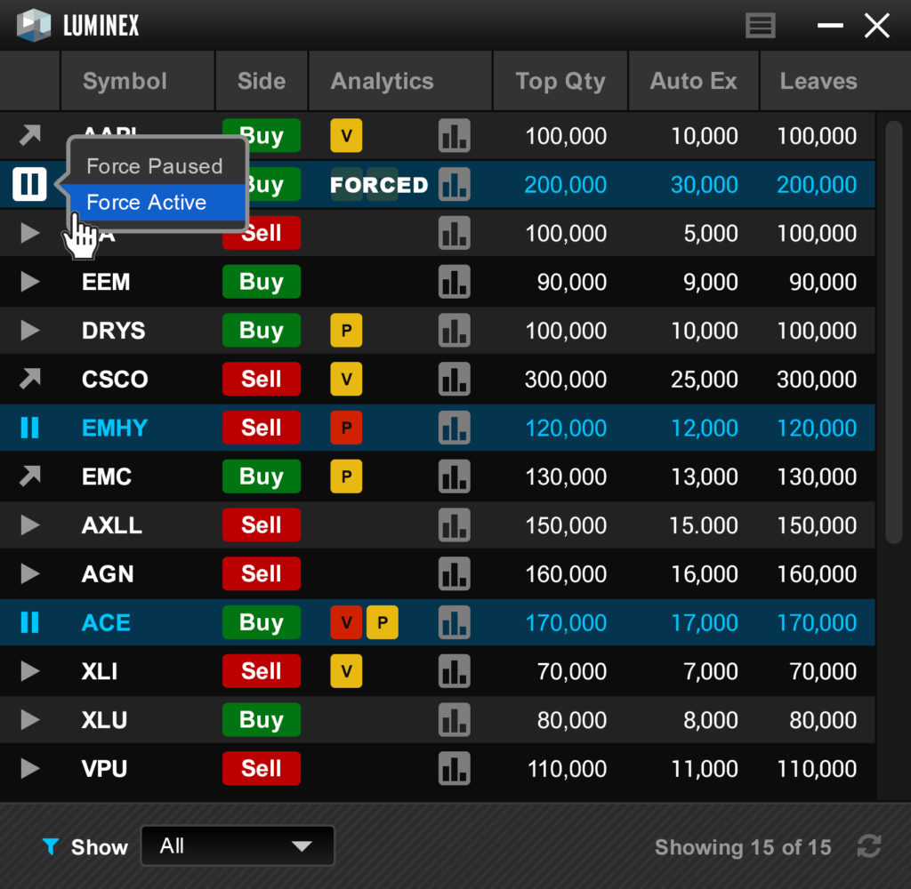
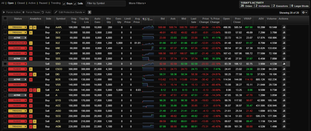
Next, we focused on how orders would appear in the blotter. There was also an “Analytics” column that called the trader’s attention to non-urgent-but-important moves in the market that affected each order.
We then placed the Mini Blotter in rough context with the space that would be taken up by the other windows already on the trader’s desktop. There was also a ‘systray’ icon that would always appear even if the mini-blotter was minimized or otherwise hidden by other windows.
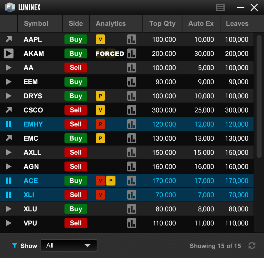
And then we put everything together. If no orders needed the trader’s attention at a given moment, we showed key statistics about the orders in flight.
Detailed Design
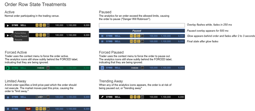
Once we had defined all of the nuts and bolts of the UX, we documented the various states so that developers knew what to build. Here are all of the permutations of the Order Row..
Visual Treatments
Our visual designer then took the patterns and color palette from the full screen app and applied them to our wireframes. The client was thrilled with the result, and the executive sponsor showed it off at the next quarterly all-hands meeting.